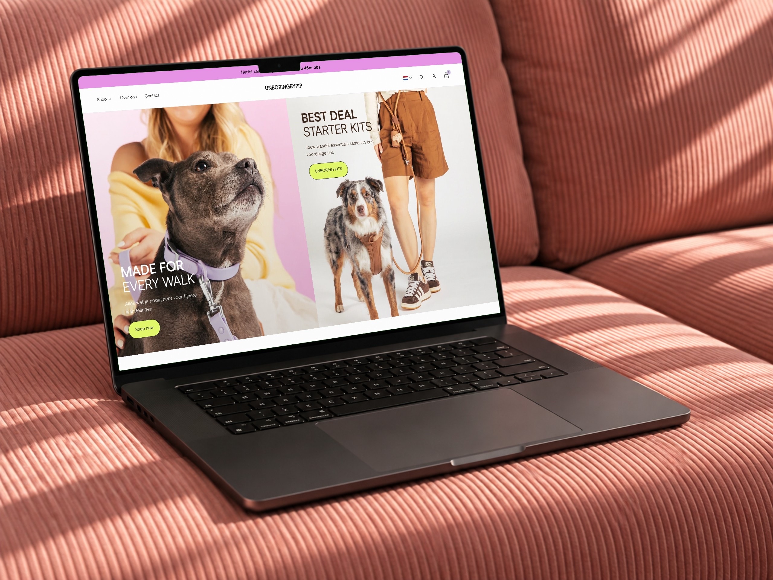
Redesigns of the homepage, product page and collection page.
- Client
- TOOT, cosmetics
- Services
- Design
- Duration
- 2 weeks
- Website
- toot.nl ↗
How it started
What we did
TOOT wanted a fresher store without rebuilding everything. We took on the three pages where most visitors land and choose.
- 01
Conversion optimisation
We started with the question of where visitors drop off. Every page we worked on was set up to make choosing and ordering easier.
AnalysisProduct pagesCheckout - 02
Page speed
Pages that load fast, especially on mobile. We kept apps, images and code light, so the store feels quick.
ImagesAppsMobile - 03
Homepage
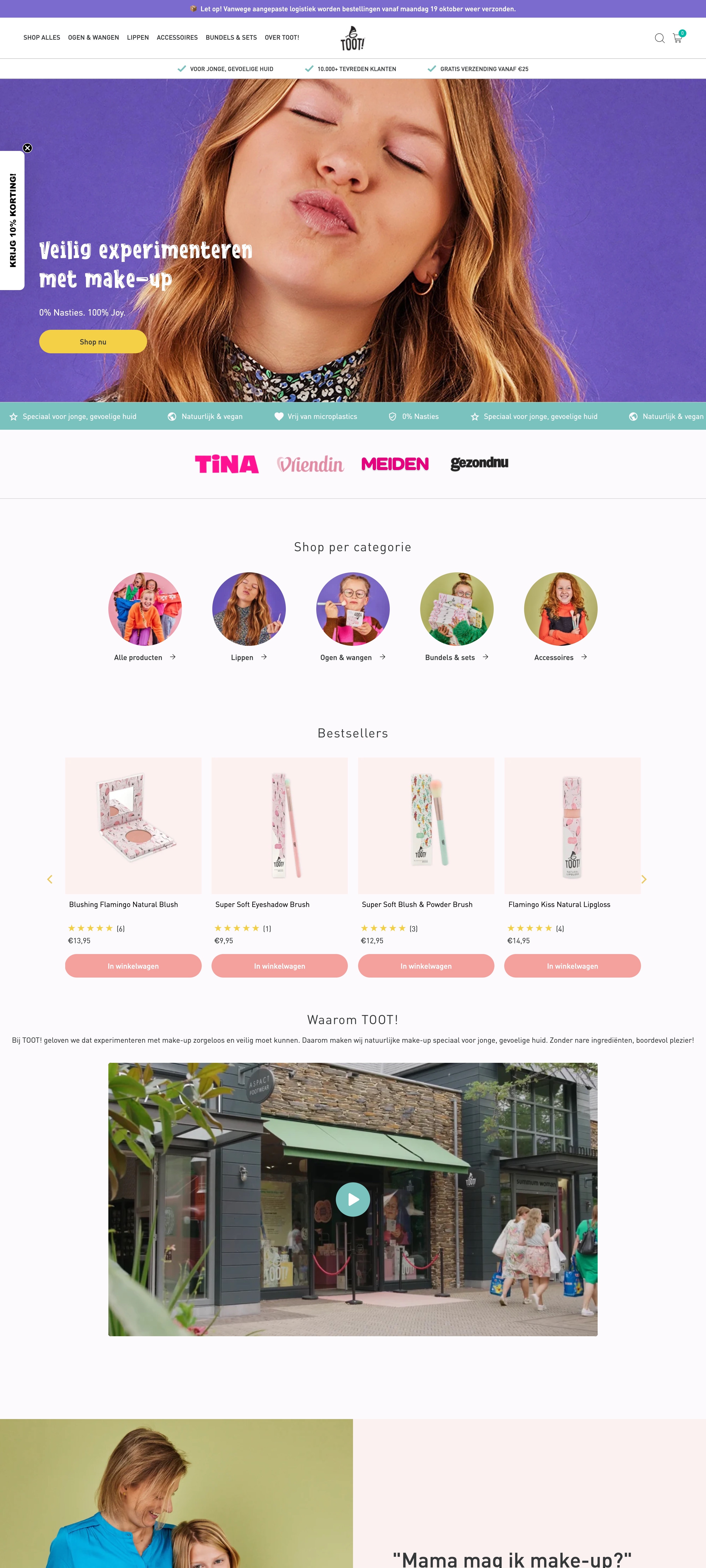
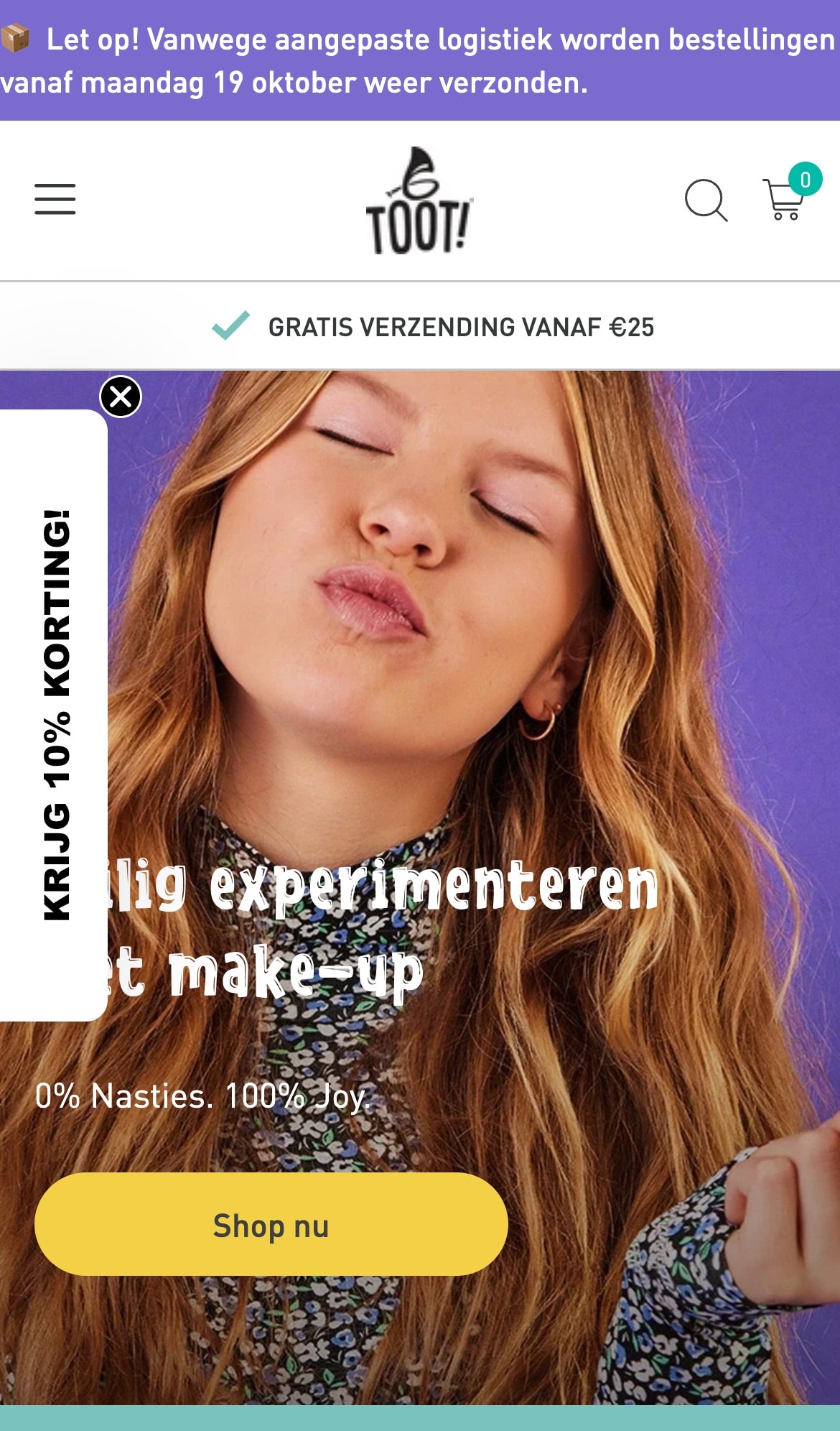
Redesigned and rebuilt, with the brand's joyful style up front. Visitors see right away what TOOT stands for and find the products quickly.
DesignDevelopment - 04
Product page
A calmer layout with the information that helps people choose. Images, explanation and the add to cart button sit where you expect them.
DesignDevelopment - 05
Collection page
Clearer browsing through the range, in the same style as the rest. So every page feels like one whole.
DesignDevelopment
The store
How it looks
Result
3
pages redesigned
+12%
clicks to cart
2 wks
from kickoff to launch
1
style for every page